#XfQaD: Using ProgressRing for UWP and keep a single activity indicator API in Xamarin.Forms
I recently recognized that I have written quite a few “Quick-and-Dirty”-solutions for Xamarin Forms that run well for most scenarios. There is a chance they will not work in all and every scenario, and therefore may need some more work at a later point. I am sharing them to bring the ideas to the community, and often these “QaDs” are enough one needs to solve one particular problem. As they do not fit well into my other series I am writing, I gave them their own tag: #XfQaD.
The scenario
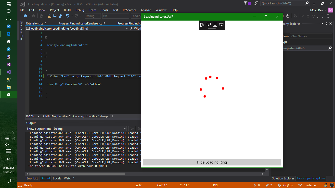
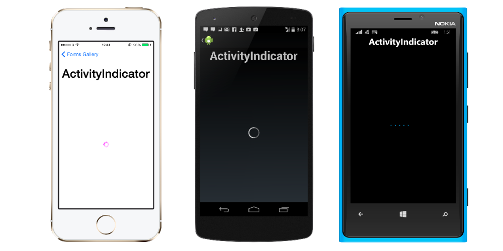
The first scenario may not be important to a lot of people, but I wanted to solve this rather small one quickly for me. The UWP implementation of Xamarin Forms’ ActivityIndicatoruses the ProgressBarinstead of a ring indicator like Android and iOS:
 ](https://developer.xamarin.com/api/type/Xamarin.Forms.ActivityIndicator/)
While this will be fine in most cases, I had the problem of limited space, and I wanted a similar UI on all three platforms for that app. The UWP has a perfect matching native control, so I implemented my own ActivityIndicatorimplementation called LoadingRing. It uses the ProgressRingcontrol on UWP and keeps the default ActivityIndicatoron all other platforms. I also wanted to keep a single API I can use throughout my app without always thinking about the platform usings.
Implementation structure
The QaD-solution I came up with has a simple structure:
- base class implementation providing the API for the custom renderer on UWP
- the custom renderer in the UWP project
- a catalyst class that unifies the different implementations
Let’s have a look into the code:
API for the custom renderer
The API for the custom render has the same properties as the Xamarin.Forms.ActivityIndicator has. They are BindableProperties, so they are perfectly prepared for MVVM. Here is all that we need in there:
1
2
3
4
5
6
7
8
9
10
11
12
13
14
15
16
17
18
19
20
21
22
23
24
25
26
 public class ProgressRingIndicator : View
{
    public ProgressRingIndicator()
    {
        if (Device.RuntimePlatform != Device.UWP)
        {
            throw new NotSupportedException($"{nameof(ProgressRingIndicator)} is just for UWP, use {nameof(ActivityIndicator)} on {Device.RuntimePlatform}");
        }
    }

    public static readonly BindableProperty ColorProperty = BindableProperty.Create("Color", typeof(Color), typeof(ProgressRingIndicator), default(Color), BindingMode.Default);

    public Color Color
    {
        get => (Color)GetValue(ColorProperty);
        set => SetValue(ColorProperty, value);
    }

    public static readonly BindableProperty IsRunningProperty = BindableProperty.Create("IsRunning", typeof(bool), typeof(ProgressRingIndicator), default(bool), BindingMode.Default);

    public bool IsRunning
    {
        get => (bool)GetValue(IsRunningProperty);
        set => SetValue(IsRunningProperty, value);
    }
}
If you need more info on the implementation of BindableProperties, just have a look at the Xamarin.Forms documentation. Basically, they are what Windows developers know as DependencyProperty.
The renderer and two little extensions
One of the great things of Xamarin.Forms is the ability to use native controls via custom renderers. It makes implementing platform specific code easy while keeping the amount of shared code pretty high. As I know that also beginners read my posts, here is once again a link to the Xamarin documentation. Let’s have a look at the two little extension I mentioned first, as they make our renderer code more readable.
| Xamarin.Forms and the UWP have different implementations of the Color structure (Xamarin | UWP). In order to connect them, we need to translate the Xamarin.Forms.Colorto a Windows.UI.Colorand pass the later one to a SolidColorBrushto give the ProgressRingthe color we want. The implementation is pretty straight forward: |
1
2
3
4
5
6
7
8
9
10
11
12
13
14
15
16
 public static class Extensions
{
    public static Color ToUwPColor(this Xamarin.Forms.Color color)
    {
        return Color.FromArgb(
            Convert.ToByte(color.A * 255),
            Convert.ToByte(color.R * 255),
            Convert.ToByte(color.G * 255),
            Convert.ToByte(color.B * 255));
    }

    public static SolidColorBrush ToUwpSolidColorBrush(this Xamarin.Forms.Color color)
    {
        return new SolidColorBrush(color.ToUwPColor());
    }
}
The Windows.UI.Color.FromArgbmethod is accepting only bytes as value, so we have to convert the Xamarin.Forms.Colorchannels to bytes and pass them along. With these extensions, we will have the color setting in the renderer in just one single line.
So let’s get finally to the renderer:
1
2
3
4
5
6
7
8
9
10
11
12
13
14
15
16
17
18
19
20
21
22
23
24
25
26
27
28
29
30
31
32
33
34
35
36
37
38
39
40
41
42
43
44
45
46
47
48
49
50
51
52
53
54
55
 [assembly: ExportRenderer(typeof(ProgressRingIndicator), typeof(ProgressRingIndicatorRenderer))]
namespace [YourNameSpaceHere].UWP
{
    public class ProgressRingIndicatorRenderer : ViewRenderer<ProgressRingIndicator, ProgressRing>
    {
        private ProgressRing _progressRing;

        protected override void OnElementChanged(ElementChangedEventArgs<ProgressRingIndicator> e)
        {
            base.OnElementChanged(e);

            if (this.Control != null) return;

            _progressRing = new ProgressRing();

            if (e.NewElement != null)
            {
                _progressRing.IsActive = this.Element.IsRunning;
                _progressRing.Visibility = this.Element.IsRunning ? Visibility.Visible : Visibility.Collapsed;
                var xfColor = this.Element.Color;
                _progressRing.Foreground = xfColor.ToUwpSolidColorBrush();

                SetNativeControl(_progressRing);
            }
        }

        protected override void OnElementPropertyChanged(object sender, PropertyChangedEventArgs e)
        {
            base.OnElementPropertyChanged(sender, e);

            if (e.PropertyName == nameof(ProgressRingIndicator.Color))
            {
                _progressRing.Foreground = this.Element.Color.ToUwpSolidColorBrush();
            }

            if (e.PropertyName == nameof(ProgressRingIndicator.IsRunning))
            {
                _progressRing.IsActive = this.Element.IsRunning;
                _progressRing.Visibility = this.Element.IsRunning ? Visibility.Visible : Visibility.Collapsed;
            }

            if (e.PropertyName == nameof(ProgressRingIndicator.WidthRequest))
            {
                _progressRing.Width = this.Element.WidthRequest > 0 ? this.Element.WidthRequest : 20;
                UpdateNativeControl();
            }

            if (e.PropertyName == nameof(ProgressRingIndicator.HeightRequest))
            {
                _progressRing.Height = this.Element.HeightRequest > 0 ? this.Element.HeightRequest : 20;
                UpdateNativeControl();
            }
        }
    }
}
ViewRender<TElement, TNativeElement>enables us to use native controls in Xamarin.Forms, so we’re deriving from it. Like any custom renderer, our renderer overrides the OnElementChangedmethod to set the initial rendering values. The Controlproperty is the native control implementation, while the Xamarin.Forms control comes in via ElementChangedEventArgs.NewElementproperty, but you can also use the Elementproperty in most cases.
In order to react to changes of the different properties of the control, we need to handle the OnElementPropertyChangedevent. This event can fire quite often, so it makes absolutely sense to filter code execution to run only when a specific property change happens.
Bring back my single API
With the code above, I am already able to use the ProgressRingIndicator. However, I have to use the On<T>platform implementation everywhere to do so. As I already mentioned before, I want to have a single API when I use the control. To solve this problem, I created a catalyst class:
1
2
3
4
5
6
7
8
9
10
11
12
13
14
15
16
17
18
19
20
21
22
23
24
25
26
27
28
29
30
31
32
33
34
35
36
37
38
39
40
41
42
43
44
45
46
47
48
49
50
51
52
53
54
55
56
57
58
59
60
61
62
63
64
65
66
67
68
69
70
71
72
73
74
75
76
77
78
79
80
81
82
83
84
85
86
87
88
89
90
91
 public class LoadingRing : ContentView
{
    public readonly ProgressRingIndicator UwpProgressRing;
    public readonly ActivityIndicator ActivityIndicator;

    public LoadingRing()
    {
        switch (Device.RuntimePlatform)
        {
            case Device.UWP:
                this.UwpProgressRing = new ProgressRingIndicator();
                this.UwpProgressRing.HorizontalOptions = LayoutOptions.FillAndExpand;
                this.UwpProgressRing.VerticalOptions = LayoutOptions.FillAndExpand;
                this.Content = this.UwpProgressRing;
                break;
            default:
                this.ActivityIndicator = new ActivityIndicator();
                this.ActivityIndicator.HorizontalOptions = LayoutOptions.FillAndExpand;
                this.ActivityIndicator.VerticalOptions = LayoutOptions.FillAndExpand;
                this.Content = this.ActivityIndicator;
                break;
        }

        SizeChanged += LoadingRing_SizeChanged;

    }

    private void LoadingRing_SizeChanged(object sender, EventArgs e)
    {
        switch (Device.RuntimePlatform)
        {
            case Device.UWP:
                this.UwpProgressRing.HeightRequest = this.HeightRequest;
                this.UwpProgressRing.WidthRequest = this.WidthRequest;
                break;
            default:
                this.ActivityIndicator.HeightRequest = this.HeightRequest;
                this.ActivityIndicator.WidthRequest = this.WidthRequest;
                break;
        }
    }

    public static readonly BindableProperty ColorProperty = BindableProperty.Create("Color", typeof(Color), typeof(LoadingRing), default(Color), BindingMode.Default, propertyChanged: OnColorPropertyChanged);

    private static void OnColorPropertyChanged(BindableObject bindable, object oldvalue, object newvalue)
    {
        if (bindable is LoadingRing current)
        {
            switch (Device.RuntimePlatform)
            {
                case Device.UWP:
                    if (current.UwpProgressRing != null) current.UwpProgressRing.Color = (Color)newvalue;
                    break;
                default:
                    if (current.ActivityIndicator != null) current.ActivityIndicator.Color = (Color)newvalue;
                    break;
            }
        }
    }

    public Color Color
    {
        get => (Color)GetValue(ColorProperty);
        set => SetValue(ColorProperty, value);
    }

    public static readonly BindableProperty IsRunningProperty = BindableProperty.Create("IsRunning", typeof(bool), typeof(LoadingRing), default(bool), BindingMode.Default, propertyChanged: OnIsRunningChanged);

    private static void OnIsRunningChanged(BindableObject bindable, object oldvalue, object newvalue)
    {
        if (bindable is LoadingRing current)
        {
            switch (Device.RuntimePlatform)
            {
                case Device.UWP:
                    if (current.UwpProgressRing != null) current.UwpProgressRing.IsRunning = (bool)newvalue;
                    break;
                default:
                    if (current.ActivityIndicator != null) current.ActivityIndicator.IsRunning = (bool)newvalue;
                    break;
            }
        }
    }

    public bool IsRunning
    {
        get => (bool)GetValue(IsRunningProperty);
        set => SetValue(IsRunningProperty, value);
    }

}
The implementation derives from ContentView. Depending on the platform my app is running, I am using my custom implementation of the ProgressRingIndicatorcontrol or the default Xamarin.Forms.ActivityIndicator to set the Contenton it. It is also important to handle the SizeChangedevent properly, otherwise the control will never be resized. As the custom implementation before, this catalyst exposes the same properties as the ActivityIndicator, so it is very easy to replace all existing places where I use the default control with it.
That’s it, we have a QaD-implementation that makes it easier to have a similar activity-indicating UI across platforms now. If you want to see it in action, there is a sample available on GitHub. As always, I hope this post is helpful for some of you.
Happy Coding, everyone!