How to implement a bindable progress indicator (loading dots) for MVVM Windows (8.1) Universal apps

Now that I am on a good way to understand and use the MVVM pattern, I am also finding that there are some times rather simple solutions for every day problems. One of these problems is that we don’t have a global progress indicator for Windows Universal apps. That is a little bit annoying, and so I wrote my own solution. I don’t know if this is good or bad practice, but my solution is making it globally available in a Windows Universal app. The best thing is, you just need to bind to a Boolean property to use it. No Behaviors, just the one base implementation and Binding (Yes, I am a bit excited about it). For your convenience, I attached a demo project at the end of this post.
To get the main work for this done, we are implementing our own class, inherited from the Page class. The latter one is available for Windows as well as Windows Phone, so we can define it in the shared project of our Universal app. To do so, add a new class in the shared project. I named it PageBase (as it is quite common for this scenario, as I found out).
First, we need to inherit our class from the Page class:
1
 public abstract class PageBase : Page
Now that we have done this, we need a global available property that we can bind to. We are using a DependencyProperty to achieve this goal. To make the property reflect our changes also to the UI, we also need to hook into a PropertyChanged callback on it:
1
2
3
4
5
6
7
8
9
10
11
12
13
14
15
         //this DepenedencyProperty is our Binding target to get all the action done!
        public static readonly DependencyProperty IsProgressIndicatorNeededProperty = DependencyProperty.Register(
            "IsProgressIndicatorNeeded", typeof (bool), typeof (PageBase), new PropertyMetadata((bool)false, OnIsProgressIndicatorNeededChanged));

        public static void OnIsProgressIndicatorNeededChanged(DependencyObject d, DependencyPropertyChangedEventArgs e)
        {

        }

        //get and send the value of our Binding target
        public bool IsProgressIndicatorNeeded
        {
            get { return (bool) GetValue(IsProgressIndicatorNeededProperty); }
            set { SetValue(IsProgressIndicatorNeededProperty, value); }
        }
The next step we need to do is to find the UIElement we want the progress indicator to be in. To do so, we are going through the VisualTree and pick our desired element. This helper method (taken from the MSDN documentation) will enable us to find this element:
1
2
3
4
5
6
7
8
9
10
11
12
13
14
15
16
         //helper method to find children in the visual tree (taken from MSDN documentation)
        private static void FindChildren<T>(List<T> results, DependencyObject startNode)
          where T : DependencyObject
        {
            int count = VisualTreeHelper.GetChildrenCount(startNode);
            for (int i = 0; i < count; i++)
            {
                var current = VisualTreeHelper.GetChild(startNode, i);
                if ((current.GetType()) == typeof(T) || (current.GetType().GetTypeInfo().IsSubclassOf(typeof(T))))
                {
                    T asType = (T)current;
                    results.Add(asType);
                }
                FindChildren<T>(results, current);
            }
        }
The method goes through the VisualTree, starting at the point we are throwing in as DependecyObject and gives us a List<T> with all specified Elements. From this List we are going to pick our UIElement that will hold the progress indicator for us. Let’s create a new method that will do all the work for us:
1
2
3
         private void CheckIfProgressIndicatorIsNeeded(DependencyObject currentObject)
        {
        }
Notice the DependencyObject parameter? This makes it easier for us to use the method in different places (which we will, more on that later). Let’s get our list of DependencyObjects from our parameter and pick the first Grid as our desired UIElement to hold the progress indicator:
1
2
3
4
5
6
7
8
9
10
             if (currentObject == null) return;

            //getting a list of all DependencyObjects in the visual tree
            var children = new List<DependencyObject>();
            FindChildren(children, currentObject);
            if (children.Count == 0) return;

            //getting a reference to the first Grid in the visual tree
            //this can be any other UIElement you define
            var rootGrid = (Grid)children.FirstOrDefault(i => i.GetType() == typeof(Grid));
Now that we have this, we are already at the point where we need to create our progress indicator object. I declared a class member of type ProgressBar (which needs to be instantiated in the constructor then). This is how I set it up:
1
2
3
4
5
             //setting up the ProgressIndicator
            //you can also create a more complex object for this, like a StackPanel with a TextBlock and the ProgressIndicator in it
            _progressIndicator.IsIndeterminate = IsProgressIndicatorNeeded;
            _progressIndicator.Height = 20;
            _progressIndicator.VerticalAlignment = VerticalAlignment.Top;
The final step in the PageBase class is to check if there is already a chikd of type ProgressBar, if not adding it to the Grid and setting it’s Visibility property to Visible if our above attached DependencyProperty has the value ‘true’:
1
2
3
4
5
6
7
8
9
10
             //showing the ProgressIndicator
            if (IsProgressIndicatorNeeded)
            {
                //only add the ProgressIndicator if there isn't already one in the rootGrid
                if (!rootGrid.Children.Contains(_progressIndicator))
                {
                    rootGrid.Children.Add(_progressIndicator);
                }
                _progressIndicator.Visibility = Visibility.Visible;
            }
If the value is ‘false’, we are setting the Visibility back to collapsed:
1
2
3
4
5
6
7
8
             //hiding the ProgressIndicator
            else
            {
                if (rootGrid.Children.Contains(_progressIndicator))
                {
                    _progressIndicator.Visibility = Visibility.Collapsed;
                }
            }
Now that we have this method in place, let’s go back to our callback method we have been hooking into earlier. To reflect the changes that we are throwing into our DependencyProperty, we are calling our method within the PropertyChanged callback. To do so, we are getting a reference to the PageBase class, which is needed because we are in a static method. Once we have this reference, we are calling our method to show/hide the progress indicator:
1
2
3
4
5
6
7
8
9
10
11
12
13
         public static void OnIsProgressIndicatorNeededChanged(DependencyObject d, DependencyPropertyChangedEventArgs e)
        {
            //resolving d as PageBase to enable us calling our helper method
            var currentObject = d as PageBase;

            //avoid NullReferenceException
            if (currentObject == null)
            {
                return;
            }
            //call our helper method
            currentObject.CheckIfProgressIndicatorIsNeeded(d);
        }
That’s all, we are already able to use the global progress indicator. To use this class, you need to do a few things. First, go to the code-behind part of your page. Make the class inherit from the PageBase class:
1
     public sealed partial class MainPage : PageBase
Now, let’s go to the XAML part and add a reference to your class:
1
     xmlns:common="using:MvvmUniversalProgressIndicator.Common"
Once you have done this, replace the ‘Page’ element with the PageBase class:
1
2
3
 <common:PageBase>
//
</common:PageBase>
After you have build the project, you should be able to set the Binding to the IsProgressIndicatorNeeded property:
1
     IsProgressIndicatorNeeded="{Binding IsProgressIndicatorVisible}">
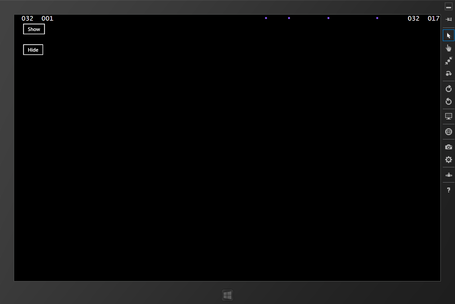
If you now add two buttons to the mix, binding their Commands to change the value of the Boolean property, you will see that you can switch the loading dots on and off like you wish. That makes it pretty easy to use it in a MVVM driven application.
But what if we need to show the progress indicator as soon as we are coming to the page? No worries, we are already prepared and need only a little more code for that. In the PageBase class constructor, register for the Loaded event:
1
             Loaded += PageBase_Loaded;
In the Loaded event, we are calling again our main method to show the progress indicator, but this time we use the current window content as reference to start with:
1
2
3
4
5
6
7
8
9
10
11
         void PageBase_Loaded(object sender, RoutedEventArgs e)
        {
            //using the DispatcherHelper of MvvmLight to get it running on the UI
            DispatcherHelper.CheckBeginInvokeOnUI(() =>
            {
                //Window.Current.Content is our visual root and contains all UIElements of a page
                var visualRoot = Window.Current.Content as DependencyObject;
                CheckIfProgressIndicatorIsNeeded(visualRoot);
            });

        }
As we need to reflect changes on the UI thread, I am using the DispatcherHelper of the MvvmLight Toolkit. You can use your own preferred method as well for that. That’s all, If you now test it with setting the IsProgressIndicatorNeeded property in your page directly to ‘True’ in XAML, you will see the loading dots right from the start.
Like always, I hope this is helpful for some of you.
Happy coding!
Download Sample project