How to generate a round image button for your Windows Phone 8.1 app (to use everywhere)
Recently, I experimented a bit because I wanted a round button that contains an image that can be used everywhere where I can add a standard button (and not just in the AppBar). I managed to get a simple style out of these experiments (sample at the end of this post).
First, you should check if you have already installed Syncfusion’s free Metro Studio (we will need it later). It is a powerful helper if you need icons, so if you do not have it, go straight ahead and download it here: https://www.syncfusion.com/downloads/metrostudio
Still here/back? Great! Ok, let’s start. In our project, generate a new button:
1
 <Button Width="72" Height="72"></Button>
If you want your round button to have a smaller size, feel free to adjust the 72 pixels mine has to your preferred value.
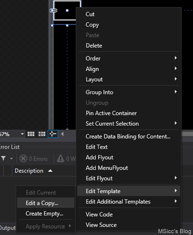
The next step is to generate a new Style. Right click on the Button, and select ‘Edit Template’, followed by ‘Edit a Copy’.
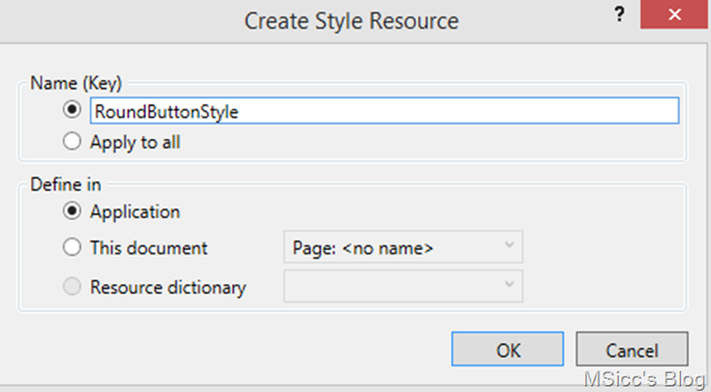
Set the name of your style in the next window, and save define it as an app-wide Style or on your page:
This should open your App.xaml file and display the button as well as the newly generated style.
We are starting with our custom style modifications right at the top:
Set both Doubles to 0 and the Thickness to 0,0.
Next, scroll down to find the Border Element of the Button Template (closing ‘VisualStateManager.VisualStateGroups’ helps a lot).
Click on the Border element and add/adjust the ‘CornerRadius’ property. At a size of 72, the minimum value is 38 for the radius. This should be fine for most cases, but it may be higher/smaller if you are using another size. Don’t worry if your button looks like this at them moment:
We are going to fix it right now by setting the Height and Width properties of our Border element:
1
2
 Height="{Binding Path=Height, RelativeSource={RelativeSource Mode=TemplatedParent}}"
Width="{Binding Path=Width, RelativeSource={RelativeSource Mode=TemplatedParent}}"
This binds the Width and Height properties of our Button to the Style. Now we just need to define the Height and the Width of our Button to make it actually look really round. Setting both to 72 will result in a nice round button.
Like you can imagine, displaying text does not make a lot of sense in this case. Round Buttons should contain an image. You could add one through adding a background, but this will result in a strange looking button when it gets pressed. Also, it does not reflect changes like a color change. To solve this, we are going to add code that is able to draw a shape for us. This is achieved with the Path Class in XAML. The Path class draws lines into a FrameworkElement like a Canvas or a Border.
To enable our Style to work with Path Data, we need to add some code before the ‘Template’ property Setter in our Style:
1
2
3
4
5
6
7
8
9
10
11
 <Setter Property="ContentTemplate">
    <Setter.Value>
        <DataTemplate>
            <Path Stretch="Uniform"
                  RenderTransformOrigin="0.5,0.5"
                  Margin="2,6,2,2"
                  Fill="{Binding Path=Foreground, RelativeSource={RelativeSource Mode=TemplatedParent}}"
                  Data="{Binding Path=Content, RelativeSource={RelativeSource Mode=TemplatedParent}}"></Path>
        </DataTemplate>
    </Setter.Value>
</Setter>
What does this code do? The ContentTemplate allows us to add rich content to our UIElement, the Button. To make it resuable, we are setting it up in our custom button style. The RenderTransforOrigin property value of 0.5,0.5 centers our Path drawn shape within the border. However, I found out that some shapes do not look good with that alone. That’s why I adjusted the Margin property together with it. This should fit most icon shapes, but you might adjust this for your own needs.
The most important aspects are the Fill property as well as the Data property. Binding the Fill Brush to the Foreground Brush property is necessary to reflect changes like theme changes as well as changes in the VisualState. Only this way it behaves like a native Button. Binding the Data property allows us to enter the Path string into the Content property of a button that uses our Style without any conversion. This makes it very simple to generate a button with our desired icon.
And this is where Syncfusion’s MetroStudio comes in handy. It allows you not only to generate icons as png, but also as shape in XAML. To get the relevant Data, open MetroStudio, search for your icon. Below the icon, there is an Edit Button. Tap it to open the icon settings page. On that settings page, you set up your button. Play around a little bit to get used to it (it’s pretty easy).
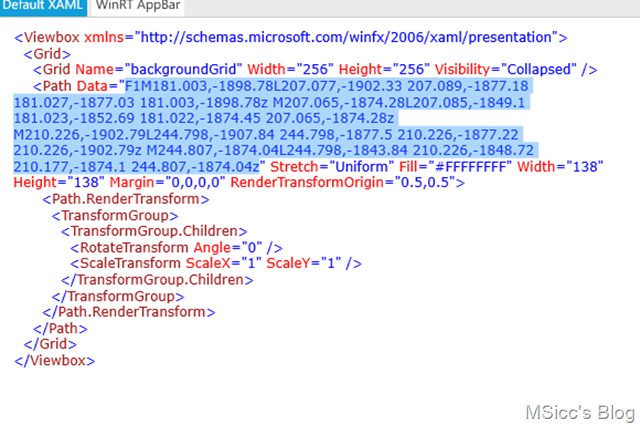
Once you have your desired icon on the screen, click on the </>XAML Button. Copy the highlighted part of the XAML code:
Back in Visual Studio, add this copied code to the Content property of our Button:
1
2
3
4
5
6
 Content="F1M181.003,-1898.78L207.077,-1902.33 207.089,-1877.18 181.027,-1877.03 181.003,-1898.78z M207.065,-1874.28L207.085,-1849.1 181.023,-1852.69 181.022,-1874.45 207.065,-1874.28z M210.226,-1902.79L244.798,-1907.84 244.798,-1877.5 210.226,-1877.22 210.226,-1902.79z M244.807,-1874.04L244.798,-1843.84 210.226,-1848.72 210.177,-1874.1 244.807,-1874.04z"
Height="72"
Width="72"
Style="{StaticResource RoundButtonStyle}"
VerticalAlignment="Center"
HorizontalAlignment="Center"/>
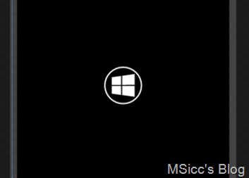
Which will result in this nice looking round button with a Windows logo on it:
If you run the sample project, you can see that the Button behaves like a native Button with text. Download the sample project here.
I am pretty sure this can be improved. I will continue to play around with this, and if I have found enough optimizations, I will write another post about them. Until then, this should help you to get started with your own round button – and the best thing: you can use it like any standard button wherever you want in your Windows (Phone) 8.1 app!
Happy coding, everyone!
